Analyzing the NCAA Men's Basketball Tournament Field of 68
I just returned from an event in Las Vegas, which intentionally coincided with the first weekend of the NCAA Men’s Basketball Tournament. In preparation, I attempted to analyze the 68 tournament NCAA Tournament teams, hoping to make a few profitable predictions. I went in with low expectations, thanks in part to statistics posts about how difficult it is to profit, even with better-than-the-bookmaker’s odds.
I ended up breaking even. Here are a few of the plots I created using data from two Ken’s: Pomeroy’s Kenpom.com and Massey’s Consensus Rankings.
I was most concerned with the Offensive and Defensive efficiency of each team. That is, how many points each team tends to score when they have the ball, and how many points they allow when their opponent has the ball.*
(*This is better than comparing each team’s Points-per-game, since efficiency takes into consideration each team’s pace of play. A team that plays fast has more opportunities to score than one that plays slow. Using adjuated efficiency statistics helps make more apples-to-apples comparisons.)
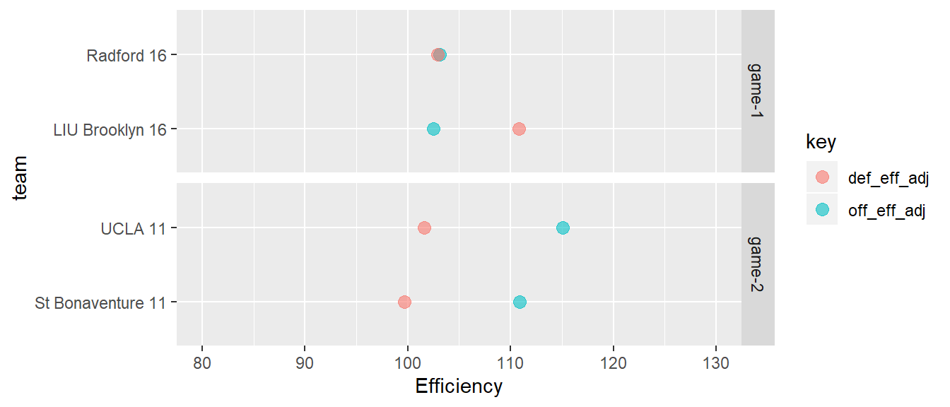
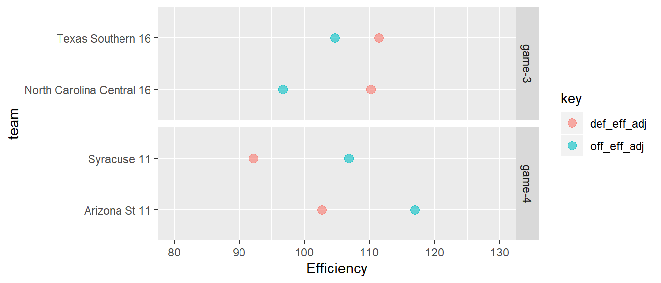
The Play-In Games
Four of the eight teams in the Play-In games featured teams whose Adjusted Defensive Efficincy measure was higher than their Adjusted Offensive Efficiency. This means that they were better at getting scored on than scoring on their opponents. Not good. This is not the case across any of the other 64 teams in the tournament field.
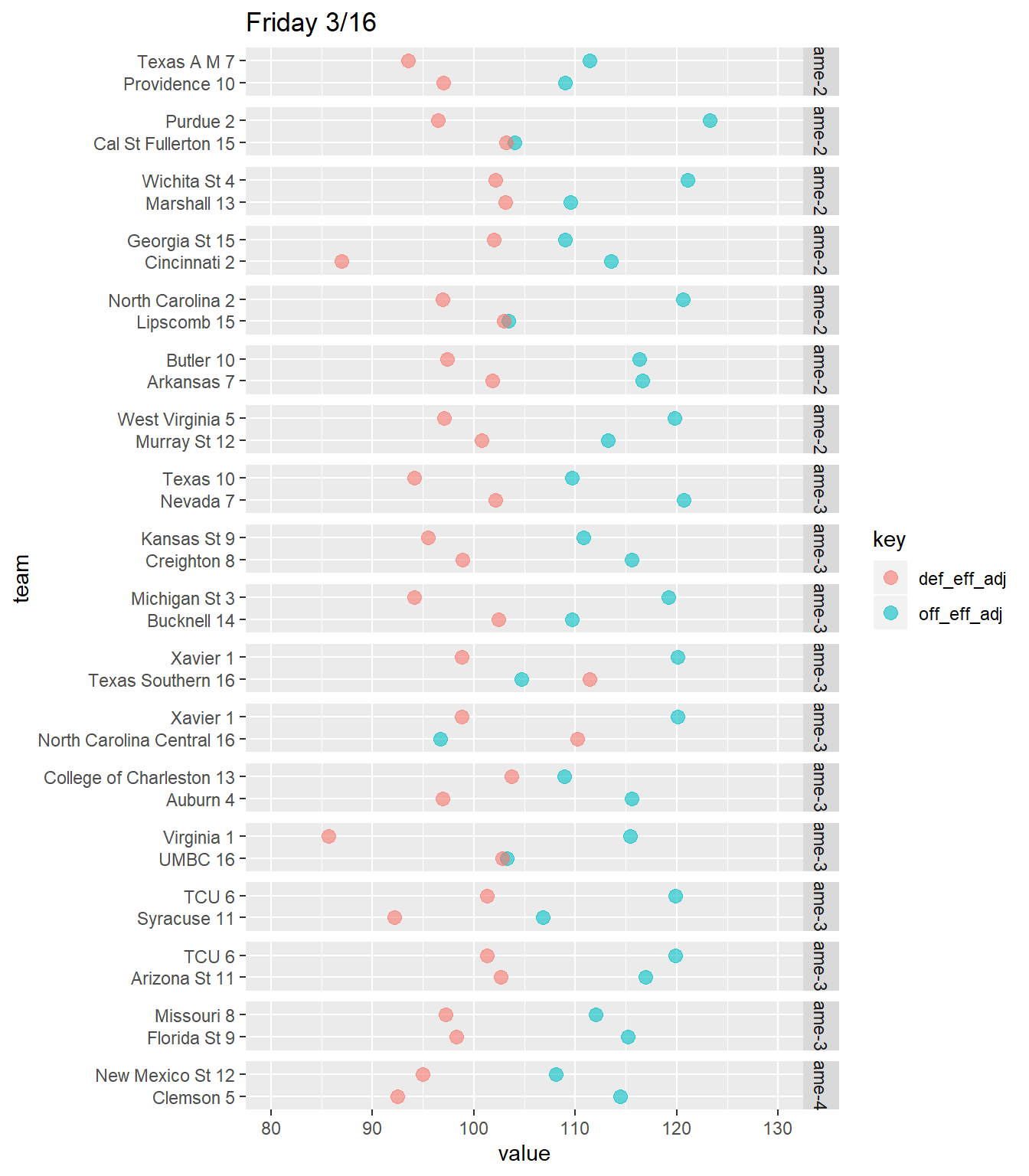
Thursday 3/15 and Friday 3/16
In general, I scanned these plots for to compare the distances between a team’s offensive dot, and their opponent’s defensive dot. This was definitely not a perfect approach. While it did explain Duke’s 22-point win over Iona, there were also quite a few upsets - namely Buffalo knocking out Aizona, despite having a much less efficient offense and defense.
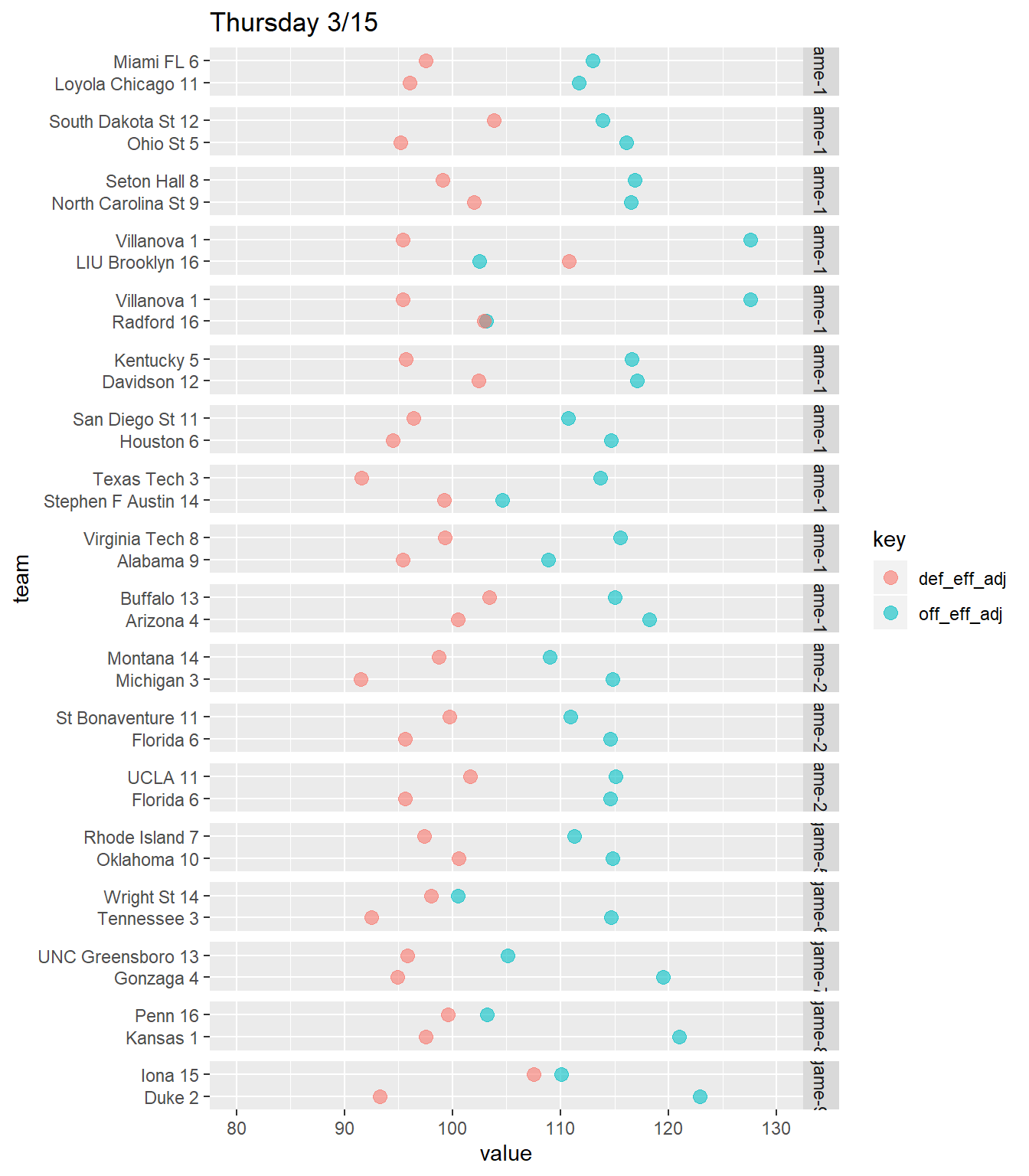
The biggest upset, of course, was UMBC’s 20-point win over Virginia. Virginia had the best defensive efficiency in the country, and a Top-30 offensive efficiency. UMBC’s were 123 and 205 out of 351, respectively.
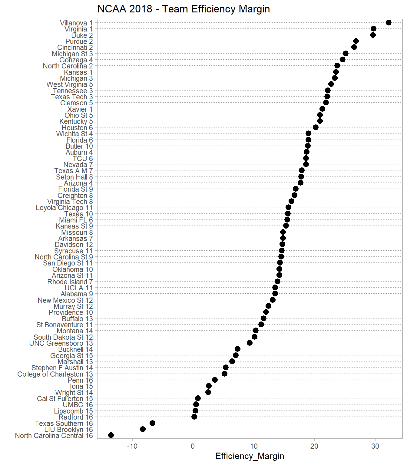
Team Efficiency Margin
Finally, I created a ranking plot based on each team’s adjusted efficiency margin. All I did here was subtract each team’s average adjusted defensive efficiency from its average adjusted offensive efficiency, and sorted from high-to-low. I figured this is a crude estimate of how good each team is.
Next time, I’ll try to incorporate each team’s efficiency over the course of the season. This should help identify consistency, uncertainty, and recency, which you can’t really tell from the average values used here.
At least my bracket is still in good shape.