Exploring Washington, D.C. Service Requests (2016)
I’ve lived in Washington for about four years, but have lived in the D.C. metropolitan area my whole life. When looking for datasets to practice ggplot2 plotting, I came across Open Data DC, a catalog of datasets maintained by various city government agencies.
I gravitated toward the Newly Updated or Added section, hoping to find a data that I haven’t read much about before. I decided on Service Request Data (i.e., residents dialing 311), thinking that picking something more boring than crime or household income meant I wouldn’t need to worry about stacking up against the constant stream great work on topics like wealth and income inequality and gentrification in the District.
This isn’t so much an analysis as it is practice on cleaning and transforming data in preparation for a few basic plots. I’ve included my code and plots below. I hope that by adding written explanations and reoganizing my code, I’ll reap some of the learning and retention benefits of re-writing notes after a lecture (although supposedly doing so on a computer is less effective).
Getting and Preparing the Data
Data retrieved from DC Data Catalog (http://data.dc.gov/)
I got started by downloading the 2016 Service Request Data as a .csv, and loading it into RStudio, alongside the dplyr, ggplot2, and scales packages.
After loading the raw data, I reformatted the column headers by converting to lowercase, and renaming the variables with underscores to make my code easier to read and write.
Next, I converted the dataframe into a tibble, because I think the print formatting looks nicer. I also coerced five of the variables to dates in the YYYY/MM/DD format.
Checking out the structure
Making a few Plots
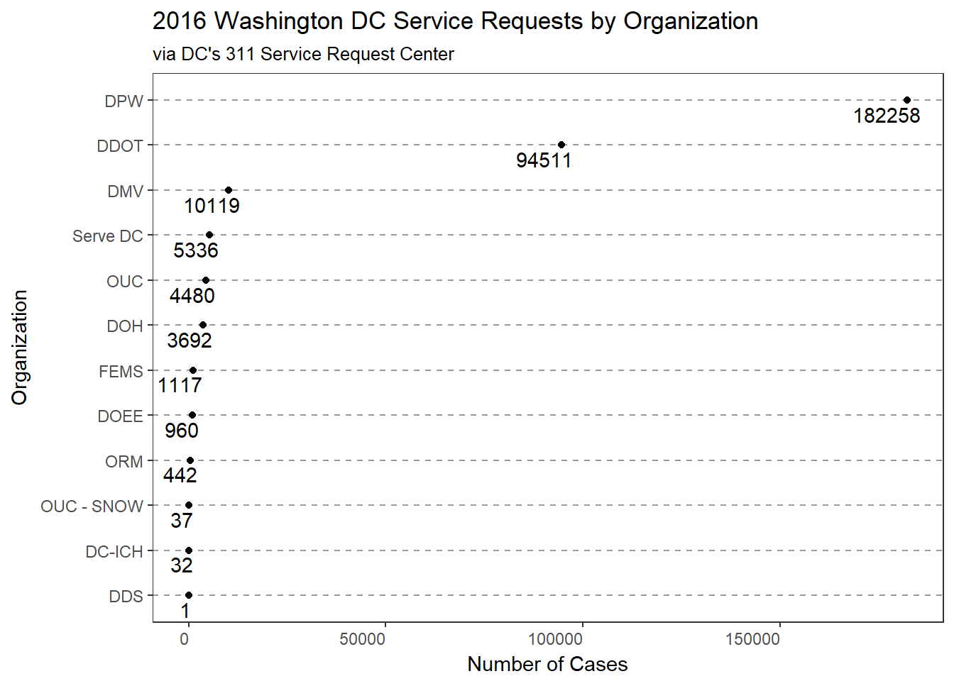
Presumably, DC residents call 311 for a variety of reasons, submitting requests with a variety of agencies. The first plot examines the number of requests filed within each organization.
As we can see, the Department of Public Works (DPW), District Department of Transportation (DDOT), Department of Motor Vehicles (DMV), and the city’s volunteerism office (Serve DC) received most of the requests in 2016.
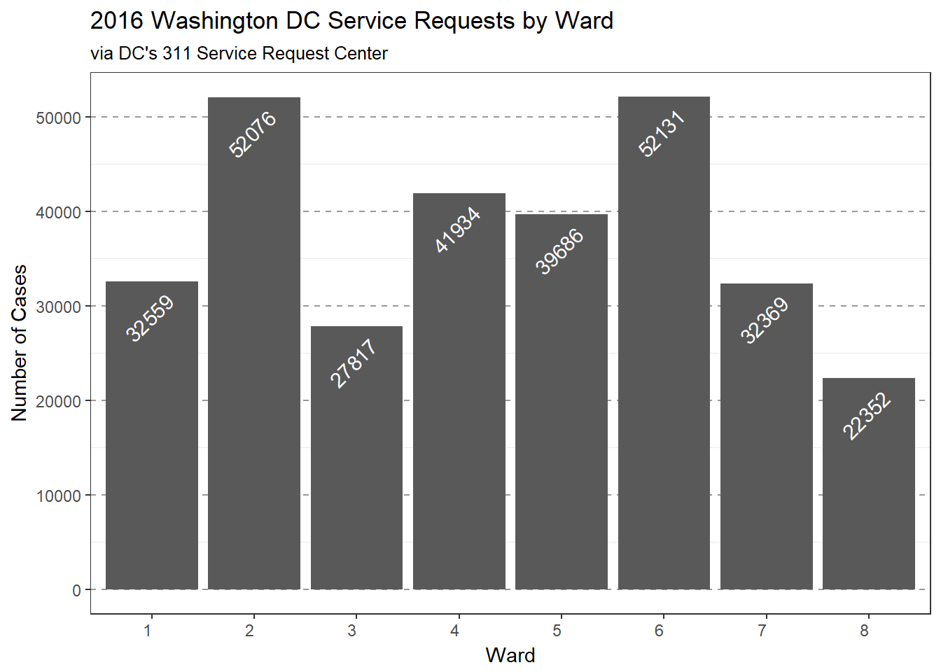
Next, I examined the number of requests filed within each of DC’s 8 Wards.
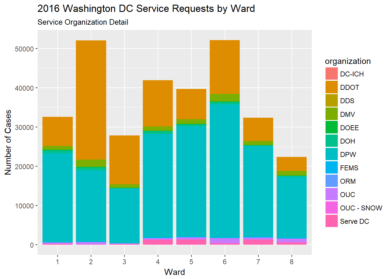
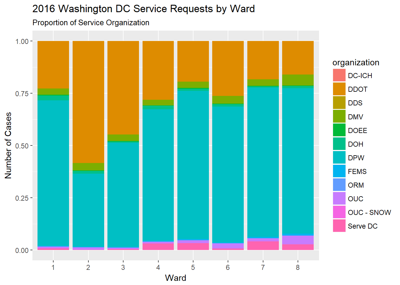
Combining the previous two segments, I plotted the number of service requests by organization, within in each Ward.
The plot below displays the absolute number of requests, while the plot below it shows requests relative to each Ward’s total.
Noticing that there was an organization related to snow, I wanted to examine the seasonality of service requests, if any.
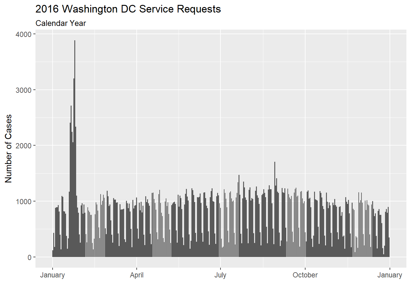
There seems to have been a huge spike in service requests in the January/February range.
What were the top-15 request days?
So, the top seven request days were consecutive from January 20-27. I didn’t dig into the spike any further, but I’d venture to guess that this was the week of the Presidental Inauguration. In the future, it would be interesting to explore the types of requests during the 2016 Inauguration week, and compare the 2016 data against the 2012 Inauguration.