2017 MLB Team Exploration: Mostly Injuries
Although the Washington Nationals have crashed out of the MLB playoffs for the fourth time in four appearances since 2012, I’m not ready to put the 2017 season to bed. I downloaded a couple of datasets from the 2017 MLB Regular Season to play around with while practicing exploratory data analysis and to practice exploratory data analysis plotting with ggplot2:
- Team Batting (baseball reference)
- Team Pitching (baseball reference)
- Team Disabled List data (spotrac)
I have a pretty superficial understanding of modern sabermetrics (i.e., FanGraphs is often over my head, I couldn’t tell you how to calculate weighted on-base average, but I understand the concepts behind Run Expectancy, Win Probability Added, WAR, and a handful of popular measures). All this to say: this analysis won’t add much value to baseball research but was fun to practice on.
With no particular goal in mind, I loaded in the 2017 Team Batting, and 2017 Team Pitching from bbref, and an American League/National League reference table, which I created myself.
Baseball Reference recently re-designed their table export functionality, where instead of downloading the table as a .csv, bbref displays a block of comma-separated text.
I loaded the data using readr’s read_csv function. The first three rows, below:
Since the team summaries from bbref included average and sum rows, I had to remove these from my data.frames, and added the AL/NL key:
Player Appearances per Team
As I started to examine the tables, I had to return to bbref to look up the #Bat and #P variables, which represent the number of distinct batters and pitchers that appeared for each team.
To get a sense of the distribution of batters used by team, I created a box-and-whisker plot.
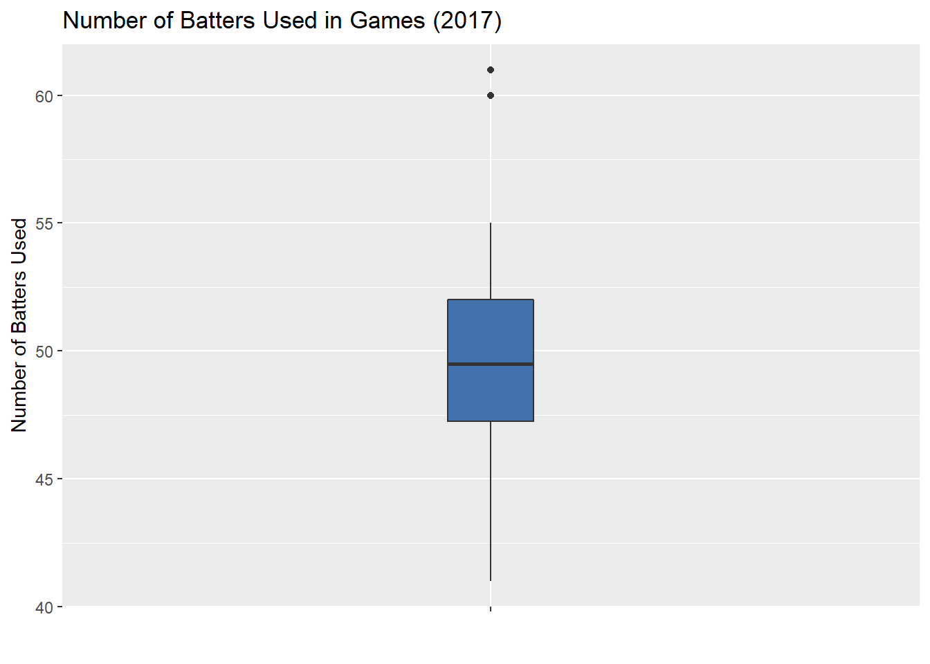
Since pitchers have to bat in the National League, I’d expect NL teams to have 4-5 more batters on average than the AL. After plotting the two leagues side-by-side, my hunch was disproved. I hadn’t considered interleague games, which effectively reverse the effect.
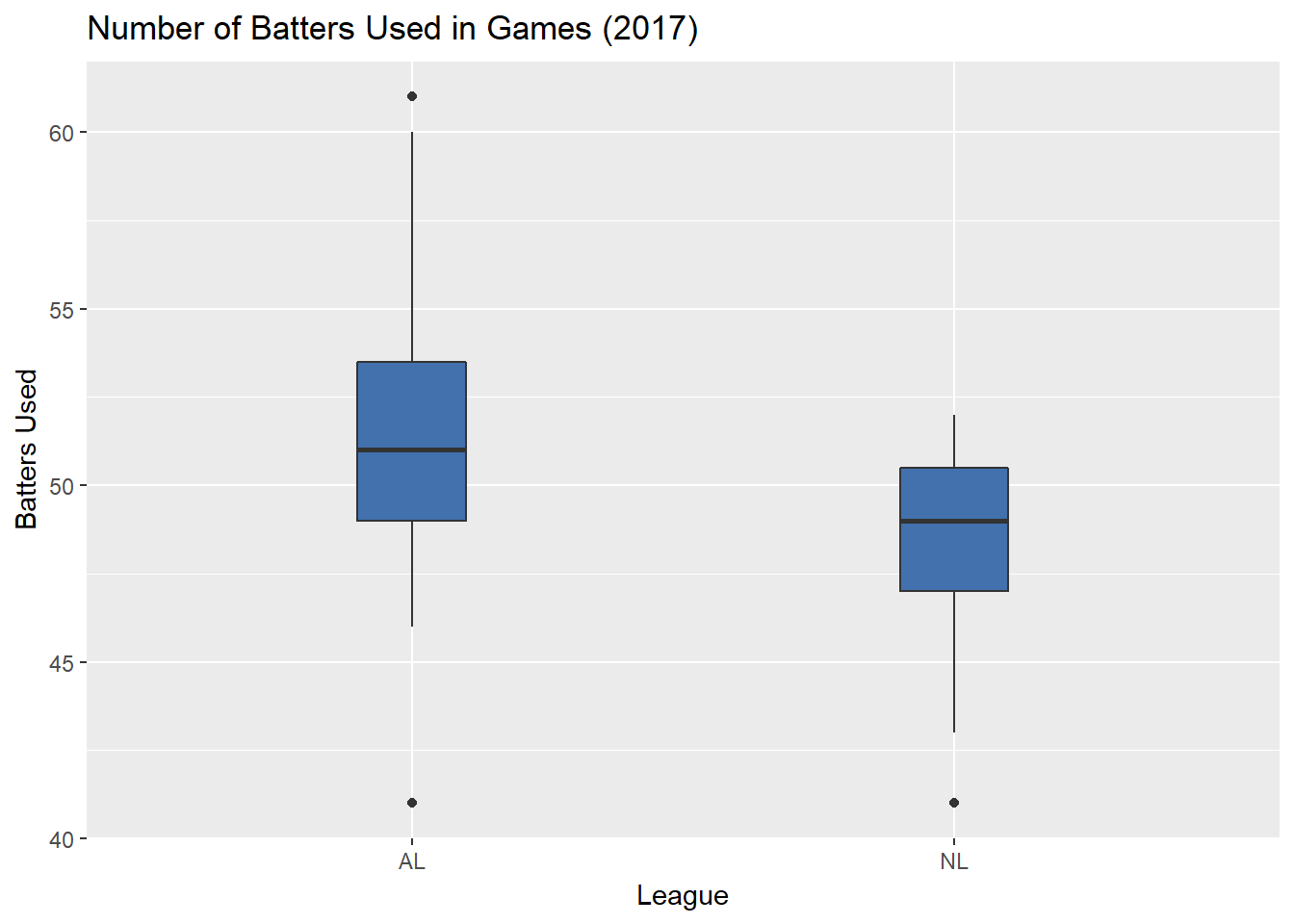
AL teams used three more batters than do NL team on average, but the outliers are intriguing.
Which teams used the most batters in each league?
Which teams used the fewest batters in each league?
Pretty interesting: Only one team among the top-5 of each league made the Postseason (LAD), compared to six of the ten teams among their league’s bottom-5 (CLE, HOU, BOS, COL, ARI, CHC).
Does this mean that teams that use fewer batters tend to win more games?
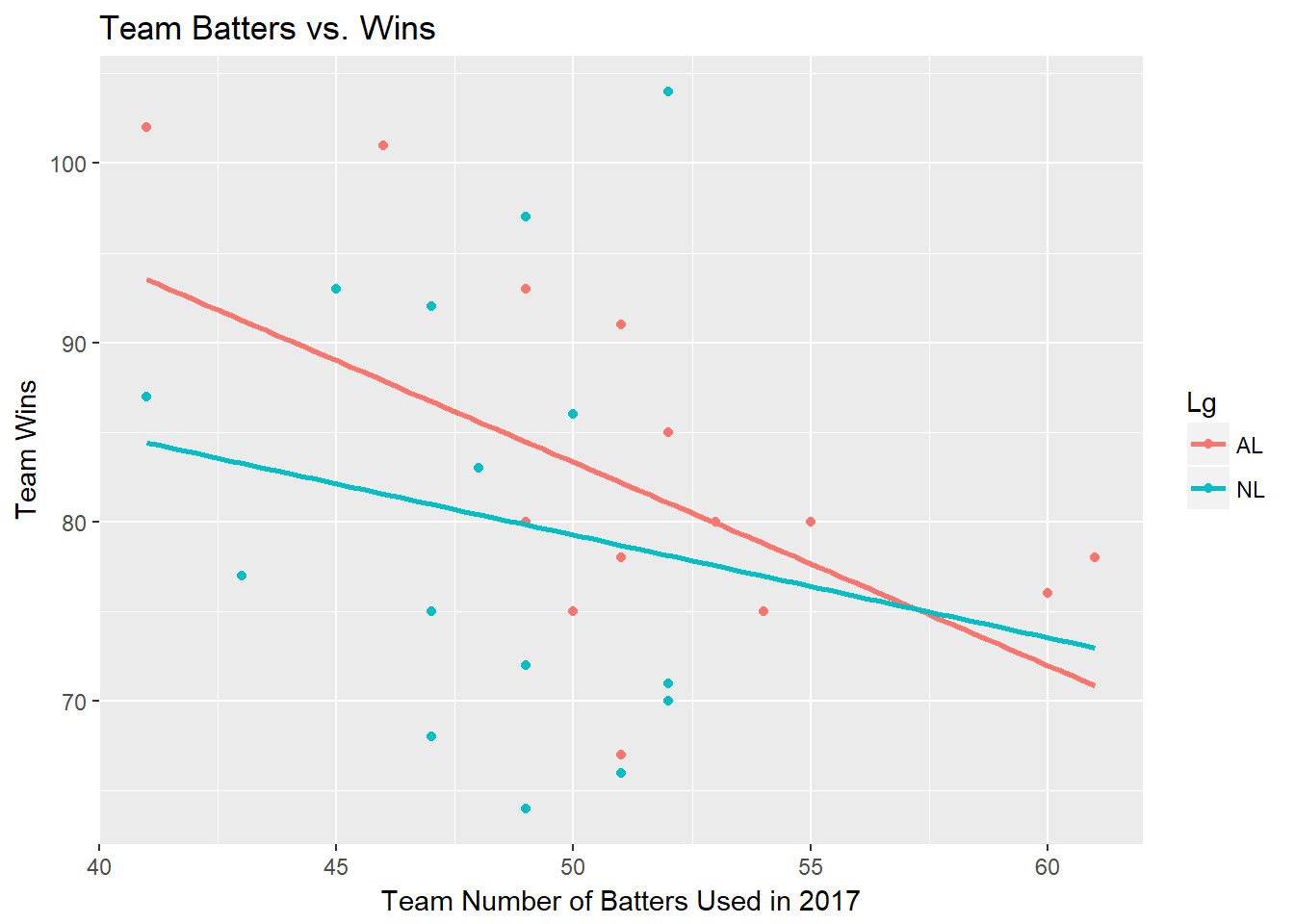
Overall, the correlation coefficient between Batters Used and Wins is -0.297201, a weak negative relationship. Among AL teams it’s -0.5112843, and for NL teams it’s -0.151149.
I anticipated the relationship to be stronger in the AL, with CLE, HOU, and BOS using the fewest batters in the AL, while combining for 296 wins. However, I wonder if these highly successful teams won more games with fewer players because they managed to avoid injuries, or simply had better individual hitters among on their rosters.
To examine this, I found MLB Disabled Listdata on Spotrac. This dataset includes each team’s number of distinct players who spent time on MLB’s Disabled List, along with the corresponding number of days. It also includes summaries on these categories among batters as well as pitchers, previewed below:
Combining the 2017 Team Injury summaries with the Team Players Used data, I created a couple of correlation plots to examine the relationships between these variables, particularly for hitters. (This is my first time using the corrplot package, so they aren’t very well-formatted.)
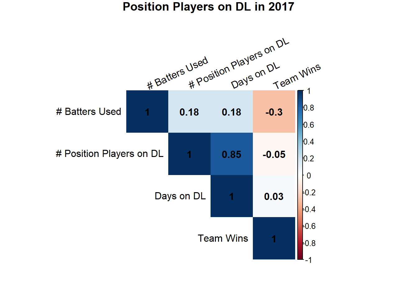
Not so surprising:
- the strongest positive correlation is between the number of players who spent time on the Disabled List, and the total number of days. (0.85)
- number of batters used is slightly negatively correlated with Team Wins (although we found earlier that the relationship is stronger in the AL than the NL.)
A bit more surprising:
-
there seems to have been almost no relationship between a team’s number of batters on the DL, and Team Wins (-0.05)
-
nor is their much of any relationship between the number of days batters spent on the DL and team wins (0.03)
How does the number of batters a team used relate to offense production?
Since there weren’t very strong relationships between disabled list activity and Team Wins, I was curious to know if teams that used more players experienced diminished offensive production overall. I used On-Base Percentage and Runs-per-game as proxies for offensive production, and created the correlation table below:
| Position Players on DL | Runs per Game | Days on DL | # Batters Used | Team Wins | OBP | |
|---|---|---|---|---|---|---|
| Position Players on DL | 1.0000000 | -0.2089881 | 0.8499177 | 0.1824023 | -0.0483877 | -0.2293197 |
| Runs per Game | -0.2089881 | 1.0000000 | -0.1851563 | -0.3955465 | 0.7217103 | 0.9069616 |
| Days on DL | 0.8499177 | -0.1851563 | 1.0000000 | 0.1800802 | 0.0342678 | -0.2274695 |
| # Batters Used | 0.1824023 | -0.3955465 | 0.1800802 | 1.0000000 | -0.2972010 | -0.4812778 |
| Team Wins | -0.0483877 | 0.7217103 | 0.0342678 | -0.2972010 | 1.0000000 | 0.7100753 |
| OBP | -0.2293197 | 0.9069616 | -0.2274695 | -0.4812778 | 0.7100753 | 1.0000000 |
Quick and not-so-surprising insights:
- slight negative correlation between position players on the DL and run production (-0.21) and on-base pct. (-0.23)
- on-base percentage is fairly negatively correlated with on-base percentage (-0.48) and runs-per-game (-0.39). Presumably, the additional batters perform at a lower level than the starters, but this would be an interesting question to analyze in the future
- both Runs/Game (0.72) and OBP(0.71) are strongly correlated with Team Wins
What about those top-performing teams that used so few players?
We found earlier that the Red Sox, Astros, and Indians combined for almost 300 wins, while among the bottom-5 in batters used. I created a small corrplot to examine the relationships between DL stints and offensive performance.
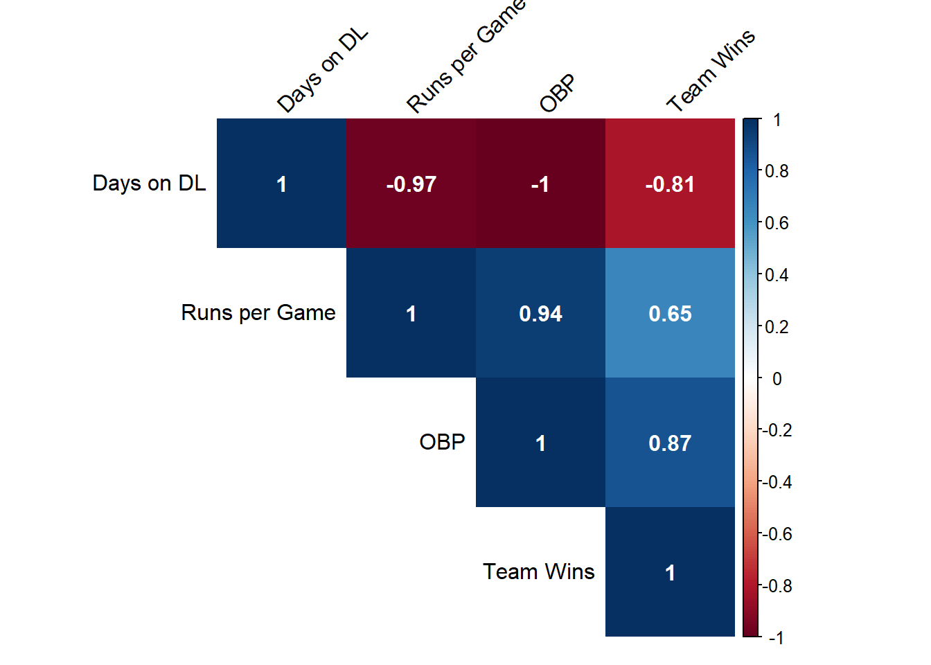
- there’s an incredibly strong relationship between BOS, CLE, and HOU’s few days on the DL, and a high on-base percentage (-0.995), and Runs/Game (-0.97)
- the ability to avoid injury goes a long way: the three teams’ R for days on the DL and Wins is -0.81 compared to the league-wide coefficient of 0.03
Questions for next time
In the future, I’d like to redo this analysis for pitchers spectifically, layering in pitch data from Statcast. A couple of recent articles piqued my interest in injury data: From 538, how the Dodgers are getting creative with MLB’s new Disabled List rules to gain a competitive advantage, and from WSJ, how baseball’s most successful pitching staffs tend to have more effective curveballs than their less-successful competitors.