Using market valuations in an NFL Pick'em Pool
This Fall, I’m playing in an NFL Pick’em contest with some friends from college. Each week, I predict the outcome of every NFL game according to Yahoo’s point-spread. For example, during Week 1 when the Patriots hosted the Texans, Yahoo assigned the Texans a seven-point handicap. My prediction came down to whether the Patriots would beat the Texans by more than seven points, or whether I thought the Texans would lose by no more than seven points (or win outright). This post is about how I will be using data to make each of the 256 predictions over the course of the season.
I remembered reading a blog post by then-statistics professor Michael Lopez about evaluating the outcomes of sporting events against the gambling market.
I’d also read about Michael Beuoy’s Inpredictable, which publishes team rankings based upon the implications of the sports wagering market. The thesis is that the wagering market is an efficient enough economy to derive the relative strengths and weaknesses of each team.
The methodology for the implied rankings is on the Inpredictable, but the basis for the rankings is on Generic Points Favored (GPF). That is, the number of points a team would be favored by against an average opponent on a neutral field.
With a fairly minimal amount of code, I have been using this data to enter my predictions each week. This is a brief overview of how to do so:
Scrape the rankings table from Inpredictable
This creates a dataframe that looks like this:
| Team | GPF | oGPF | dGPF | W-L | Projected Seed | pSOS | fSOS |
|---|---|---|---|---|---|---|---|
| LA | 7.9 | 5.6 | 2.3 | 3-0 | 0.996 | -3.2 | -0.4 |
| KC | 5.0 | 8.1 | -3.2 | 3-0 | 0.936 | 3.1 | -0.1 |
| LAC | 4.4 | 2.8 | 1.5 | 1-2 | 0.699 | 2.9 | -1.3 |
| PIT | 4.3 | 3.2 | 1.1 | 1-1-1 | 0.538 | 1.9 | 1.3 |
| BAL | 4.1 | 2.3 | 1.8 | 2-1 | 0.667 | -2.0 | 1.3 |
| NE | 3.7 | 3.3 | 0.4 | 1-2 | 0.717 | 1.4 | -1.0 |
Now that I have the up-to-date market-based team ratings, all that’s left is to compare the ratings of teams that are playing each other in the coming week. To do so, I loaded a schedule table, which looks like this:
| Week | Date | Time | Away | Home |
|---|---|---|---|---|
| 1 | September 6 | 8:20 PM | ATL | PHI |
| 1 | September 9 | 1:00 PM | PIT | CLE |
| 1 | September 9 | 1:00 PM | CIN | IND |
| 1 | September 9 | 1:00 PM | TEN | MIA |
| 1 | September 9 | 1:00 PM | SF | MIN |
| 1 | September 9 | 1:00 PM | TB | NO |
I combined the ratings with the schedule data using the dplyr package, and calculated each matchup’s offensive, defensive, and overall ratings delta:
This applies the market ratings to all matchups throughout the season. At this point, the table looks like this:
| Date | Away | Home | Favorite | Margin |
|---|---|---|---|---|
| September 20 | NYJ | CLE | NYJ | 0.6 |
| September 23 | NO | ATL | ATL | 0.1 |
| September 23 | CIN | CAR | CAR | 0.1 |
| September 23 | NYG | HOU | HOU | 1.8 |
| September 23 | TEN | JAC | JAC | 6.4 |
| September 23 | SF | KC | KC | 7.0 |
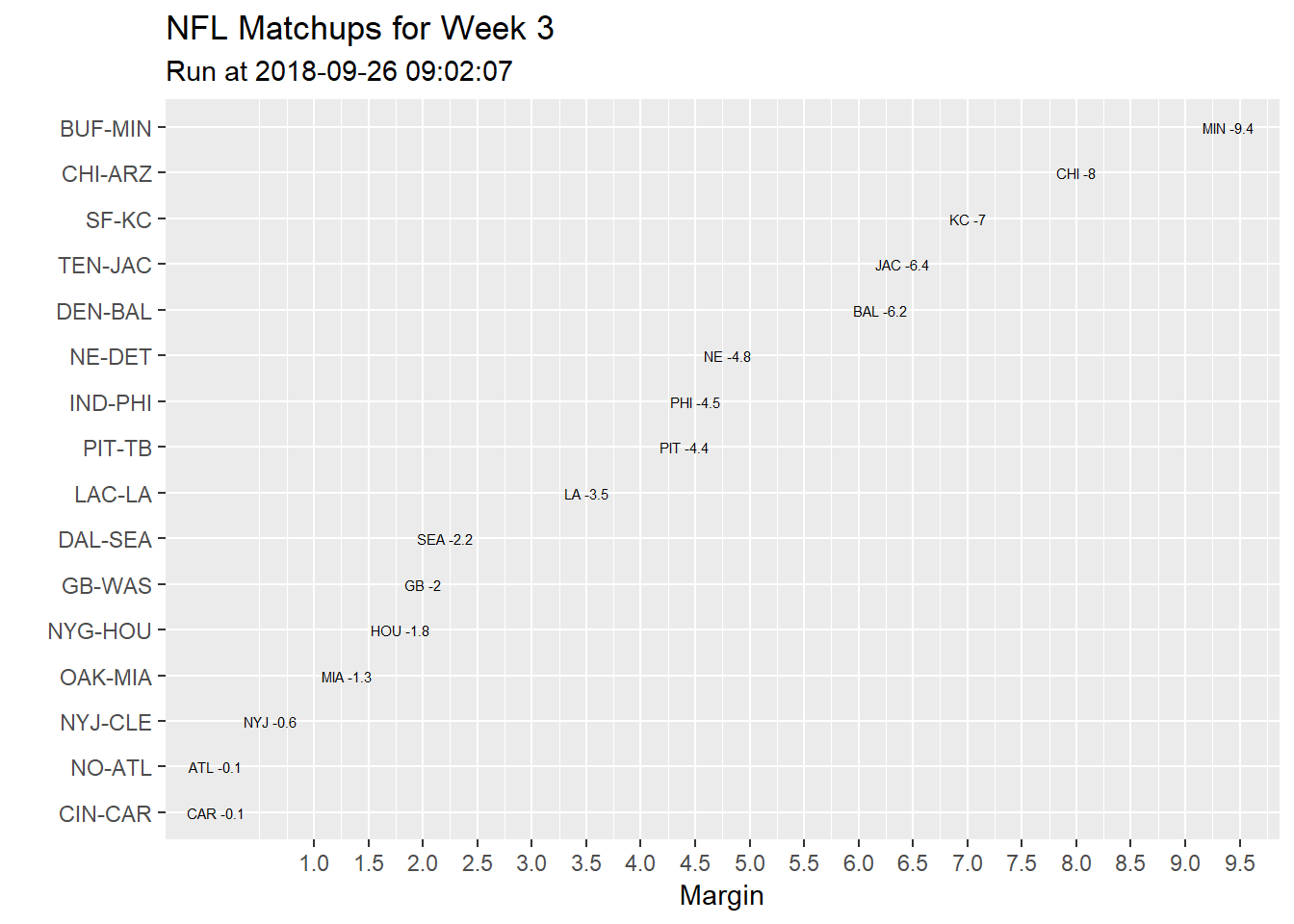
Since I am only interested in the coming week, I created a visualization with ggplot2 to quickly illustrate the predictions I will make. I wrap this into a function called getMarketRatings, which takes the NFL Schedule week as an input, and provides a match-up ratings plot, and table as output:
The table is displayed within RStudio, while the plot is saved to my computer, and looks like this: